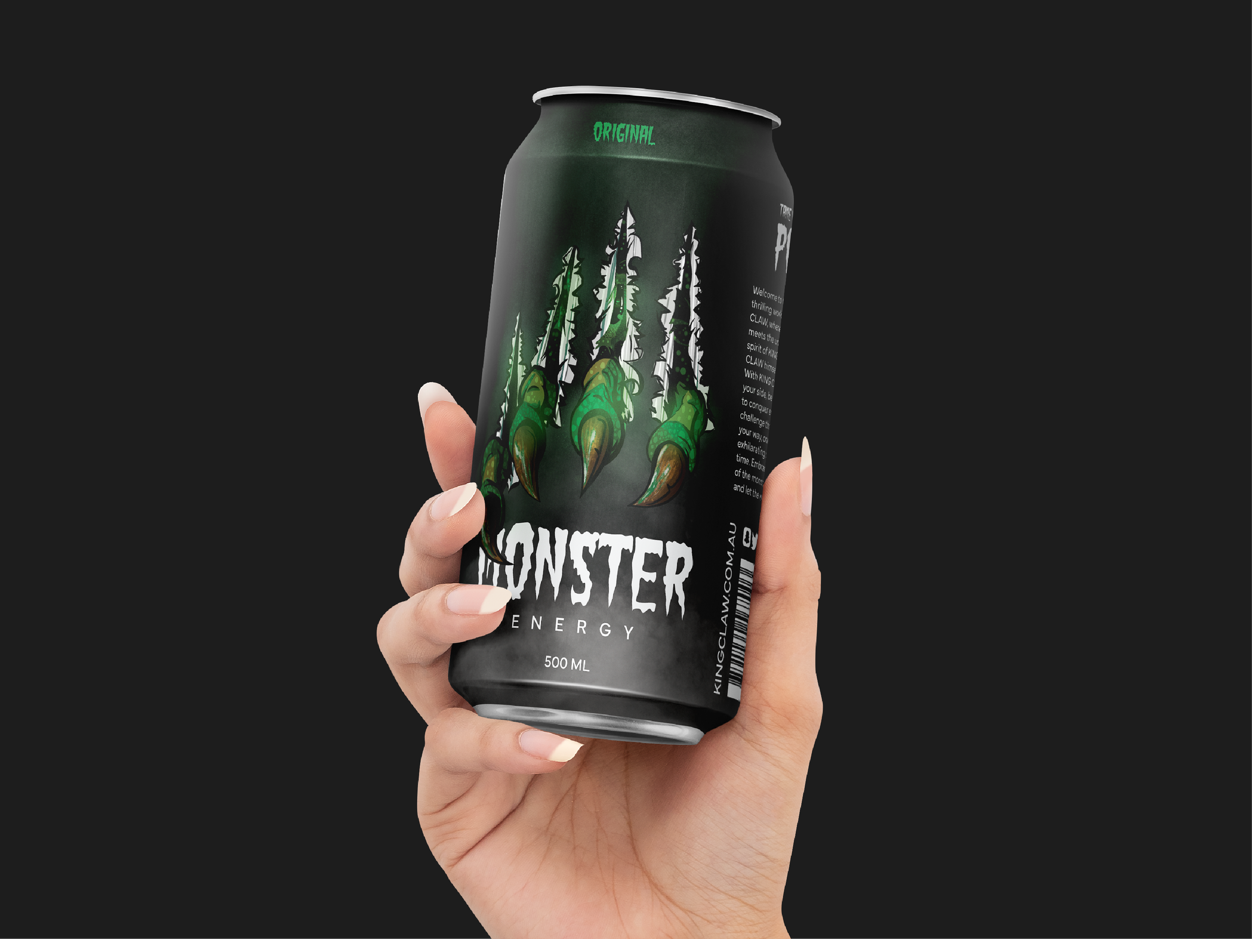
Monster Energy Limited Edition Can
My goal was to craft a bold, energetic can design that embraces maximalism, turning Monster Energy into a collector’s item.
-
Monster Energy breaks away from the mundane with its limited edition can design—a bold embrace of maximalism that redefines shelf appeal. This isn’t just packaging; it’s a dynamic story brought to life. Monstrous claws tearing through the can, a menacing yet magnetic eye peering out—it’s a design that dares you to take a sip and dive into the thrill.
-
In a market dominated by sleek minimalism, the goal was to disrupt expectations and amplify Monster’s brand identity. The challenge was to create a design that would not only stand out on shelves but also serve as a collector's item—an artistic representation of the energy and excitement the brand embodies.
-
Maximalism in Action:
To break free from conventional design trends, I leaned into maximalism, embracing intricate illustrations and bold storytelling. The tearing claws and lurking eye create a sense of movement and tension, evoking the raw energy Monster is known for.Illustrative Storytelling:
The design isn’t just eye-catching—it’s a narrative. The claws ripping through the can symbolise the untamed power of Monster Energy, while the ominous yet intriguing eye adds a layer of mystery and allure. Every detail contributes to a cohesive story that draws in the viewer.Standing Out on Shelves:
With vibrant colours, dynamic composition, and a maximalist aesthetic, the cans command attention in any setting. The bold design ensures they outshine competitors and connect instantly with Monster’s target audience.
-
Monster Energy’s limited edition can design doesn’t just hold a drink—it holds a story, a piece of art, and an invitation to adventure. By pushing the boundaries of traditional packaging, this design energizes the brand’s identity and captivates both casual consumers and loyal fans alike.


